

Your Guide to the Pantone Colour Matching System
Posted on 4th May 2018 at 18:09
The Pantone Colour Matching System is one of the most widely-used standardised colour systems in the world. From print works to painting, fabrics to plastics, this sophisticated system provides universal clarity for many different industries when it comes to colour. However, if you have never used it before, getting to grips with the Pantone Colour Matching System can be tricky. To help ensure you know what you’re doing when it comes to choosing colours for your business or home, we’ve created a guide to this globally renowned colour matching system:
What is the Pantone Colour Matching System?
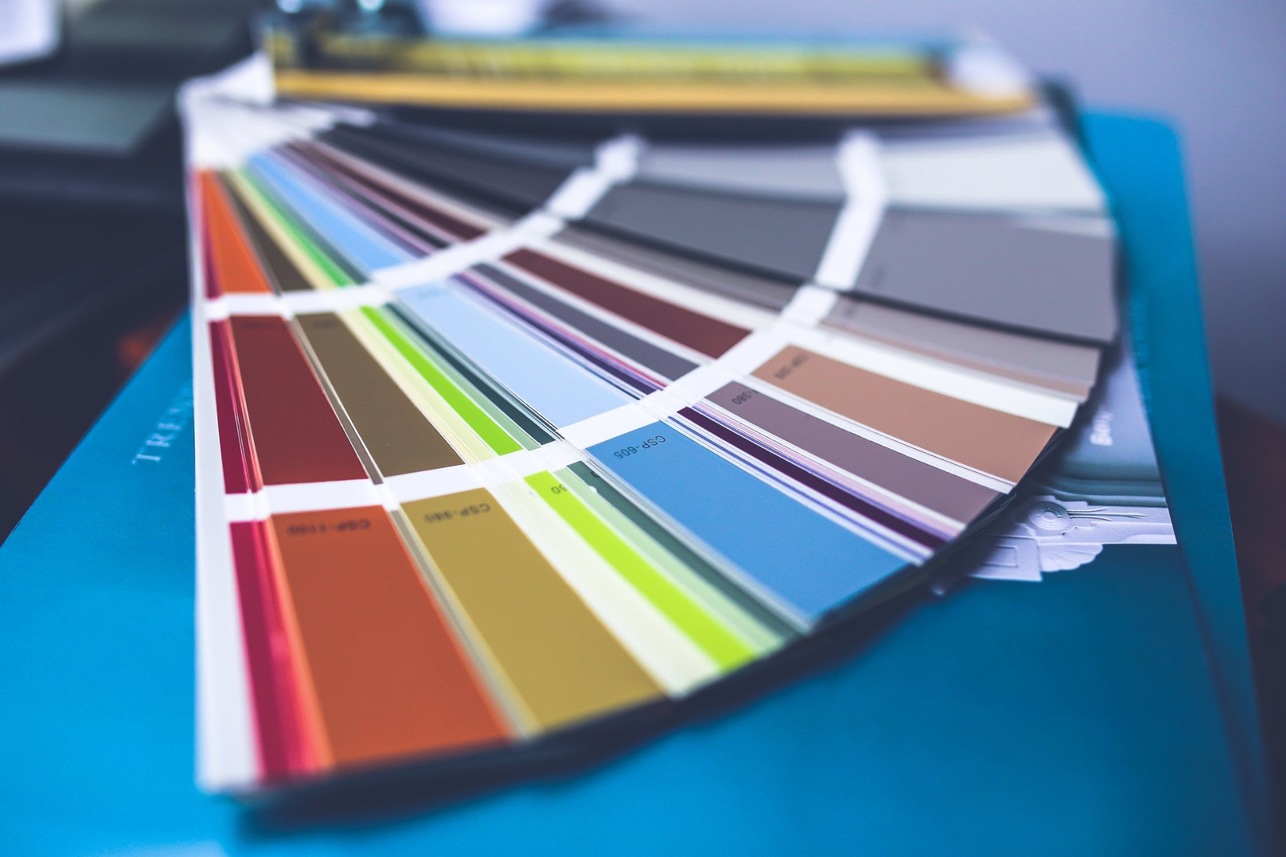
The Pantone Colour Matching System is a standardised system created to help manufacturers from different industries recognise particular colours. Using this system enables creators from around the globe to identify a specific colour without having to meet with each other in person to establish colour choices. Colours from the Pantone solids palette, which contains 1,114 different shades, are the most frequently used and can be identified using specialised coding. This coding is usually made up of the colour itself, three-four numbers and the letters C, U, or M (C=Coated Paper, U=Uncoated Paper and M=Matte Paper) e.g. Pantone Blue 033 C.
How can you utilise the Pantone Colour Matching System?
Originally, the Pantone Colour Matching System was specially created to be used by those in design to ensure consistency across the industry. For example, printers and graphic designers could reference the system to help establish the shades clients wanted for particular design work or during shared projects. Although it is still used for this purpose, many other sectors, as well as the general public, now use the Pantone Colour Matching System as a means of universal clarification when it comes to colour schemes. Consequently, if you’re choosing colours for your business or home, the Pantone Colour Matching System could make it easier for you to communicate your colour choices with suppliers like us here at Furniture Crates.
Pantone Colour of the Year 2018
As well as creating a universal colour matching system, Pantone also provides professional advice on colour trends to help you choose a shade that’s never lacking style. This year, Pantone announced their colour of the year as Ultra Violet, specifically PANTONE 18-3838 Ultra Violet. According to Pantone, this rich and enticing purple “communicates originality, ingenuity, and visionary thinking that points us toward the future”, making it the ultimate colour choice for forward-thinking business owners this year.
Take Advantage of our Bespoke Colour Service
So, whether you’re after that hot-on-trend shade of Ultra Violet or have your own colour scheme in mind, here at Furniture Crates, we can create paint colours that perfectly match shades from the Pantone Colour Matching System using our bespoke colour service. All you need to do is share your chosen Pantone shade with us and we will create a personal sample for you to approve. If you’re happy with the colour, whether you’ve opted for a retail display unit or large wooden crates, we can then produce a product that’ll you’ll love in your chosen shade!
To find out more about our bespoke colour service or to browse our extensive range of retail crate designs, visit our website now or contact us via our social media channels – we’d love to hear from you!
Share this post: